
While I understand the basic steps involved in preparing a plate for intaglio printing, I'm not a serious student of the engraved printing process and all the technical steps required to prepare a plate for actual printing, so I will rely on the Williams Brothers' classic primer, Fundamentals of Philately, to explain the purpose and function of plate guide dots and guide lines.
In this context the term "guide line" refers to any linear marking on the plate used as a "guide" during the process of preparing the plate preliminary to actual printing, and not guide lines purposely printed on sheets for uses after printing has occurred such as perforating, or cutting sheets into panes, or folding a sheet into a smaller size.

NOTE: Click on Images to Enlarge Them
Figure 2Usually, for varying reasons, the working area of the plate is marked with several series of dots, dashes and even continuous lines. The process of applying the dots and lines is termed 'laying out the plate.' All these markings, which are made after careful measurements, are made with the object of guiding the siderographist where to make the entries. Normally the intention would be that none of the markings should appear on the printed stamp--they should either be hidden by a feature of the design or obliterated by it, or else later removed from the plate. However, many instances are known of stamps bearing such dots, termed 'guide dots' or 'position dots' and lines called 'guide lines' usually within the edge of a design--in color, for, of course, the dot or line on the plate is in the form of a slight recess.

In Figure 2 the "guide dot" appears on these R171p issues in the area of the middle of the spandle between the arched words "United States" and "Internal Revenue". It's best seen in the far right stamp.

Figure 3In Figure 3 the "guide dot" on these rouletted R163 issues appears in the top selvage above the letter "C" in the word CENT just outside the edge of the design. The third stamp appears to have a double dot.

Figure 4
In Figure 4 the "guide dot" on these hyphen-hole or slot-perforated R163p issues appears just above the middle of the spandle on ALL FOUR stamps in the block.
Figure 5
In Figure 5 the "guide dot" on these 10-cent R168p issues again appears in the middle of the spandle between the arched words "United States" and "Internal Revenue" And on the right stamp there is a faint guide line running through the lower part of the left numeral "10".Figure 6
In Figure 6 the R164p at left is similar to John's R164 in that there is a "guide dot" in the letter "C" in the word CENT and part of a "guide line" showing in the right numeral "2". However, in this one there is another "guide dot" in the top selvage above the letter "C" just outside the edge of the design. There also appear to be two "guide dots" on the two-cent RB27p at right. One is just outside the top edge of the design between the letters "C" and "E" in CENTS, and another one just below and between those letters.

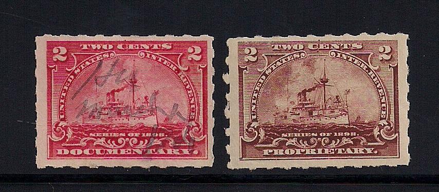

Figure 7
A "guide dot" appears in all six of the stamps in this RB20 block. In the top row the dot appears in the top selvage above the right leg of the first "H" in the word EIGHTH just outside the top edge of the design. They are faint so I've circled the dot on the first stamp in the row. In the bottom row the "guide dot" appears within the right leg of the first "H" in EIGHTH; again the dot is circled on the first stamp in the bottom row.

Figure 8
On this block of four of R171p fifty-cent issues there are no dots or guide lines visible in the top two stamps, but "guide dots" prominently appear in the middle of the spandle on the bottom two stamps and there is a dramatic guide line running entirely through both stamps, best seen in all four "50" numerals.

There were three different plate layouts for the battleship revenues and presumably all three plates were similarly prepared with guide dots and guide lines. But it's been more than a decade since I've looked at these stamps or thought about them. And as I'm not a serious student of the technical aspects of plate production, as I view them now several questions come to mind:
No comments:
Post a Comment